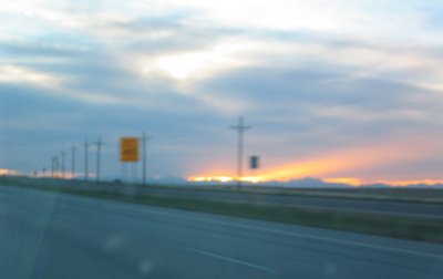
This picture was taking in the car on I-70 just outside of Denver. The sun was setting and we could see the mountains in the distance.

We all piled on this bus that was to take us to our drop-off point for our rafting adventure.

This shot was taken after our rafting adeventure. I believe those clouds brought us some snow about an hour later when we were eating pizza in Breckenridge.
Here are a few pictures of the new
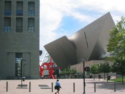
Denver Art Museum that is currently under construction.

The new building soars out over the existing art museum.

Architecture that is dangerous. The architect is Daniel Libeskind.
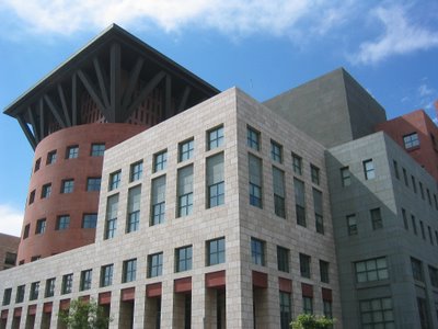
This is the Denver Public Library, which is right next to the Art Museum. This building has nice geometrical shapes. This was designed by Micheal Graves (the Target guy.)
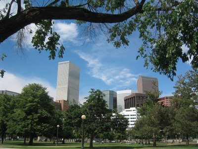
Downtown Denver from the civic lawn.
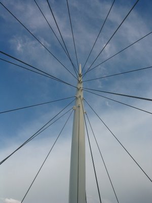
This is the structural suspension system for a pedestrian bridge at the west side of "downtown." The bridge looked somewhat like a ship with a nautical vernacular.
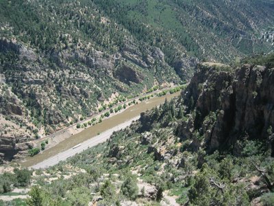
This is the view from the edge of the cliff where the "extreme swing" was placed. It was quite a rush flying out over that space. (Look for the semi on the road.)
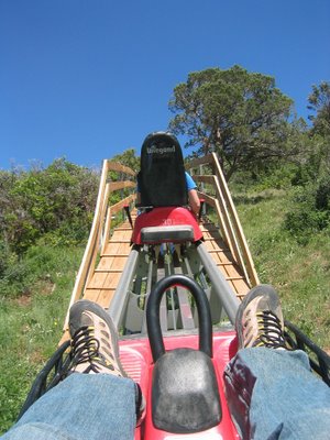
These are the Alpine Cars that rode along a rail like a coaster. We were able to control the speed. This shot is taken at the end of the ride as we are being pulled automatically back up the hill.
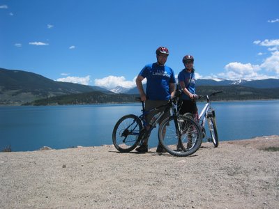
Here we are pausing for a moment to enjoy the view.
 This picture was taking in the car on I-70 just outside of Denver. The sun was setting and we could see the mountains in the distance.
 We all piled on this bus that was to take us to our drop-off point for our rafting adventure.
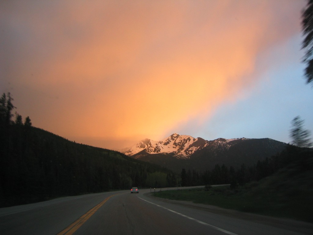 This shot was taken after our rafting adeventure. I believe those clouds brought us some snow about an hour later when we were eating pizza in Breckenridge.
 Here are a few pictures of the new Denver Art Museum that is currently under construction.
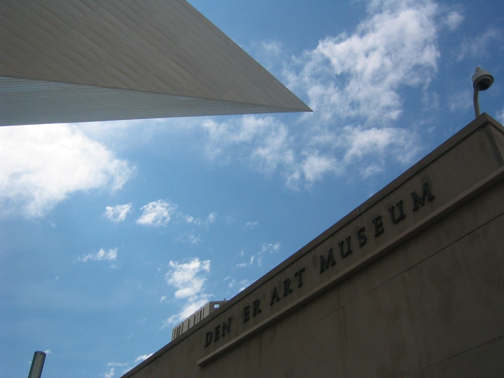 The new building soars out over the existing art museum.
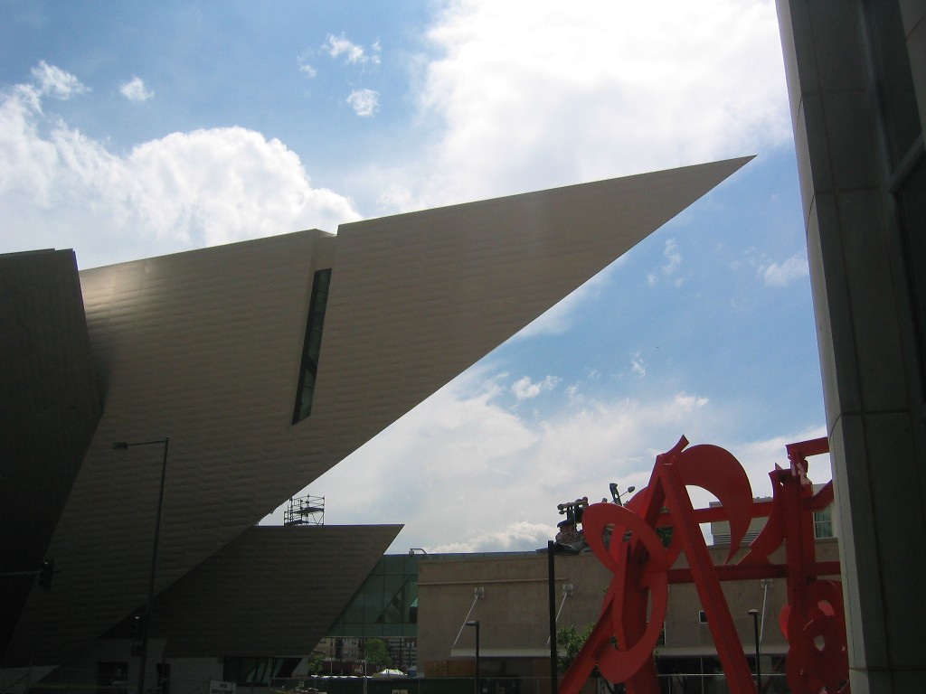 Architecture that is dangerous. The architect is Daniel Libeskind.
 This is the Denver Public Library, which is right next to the Art Museum. This building has nice geometrical shapes. This was designed by Micheal Graves (the Target guy.)
 Downtown Denver from the civic lawn.
 This is the structural suspension system for a pedestrian bridge at the west side of "downtown." The bridge looked somewhat like a ship with a nautical vernacular.
 This is the view from the edge of the cliff where the "extreme swing" was placed. It was quite a rush flying out over that space. (Look for the semi on the road.)
 These are the Alpine Cars that rode along a rail like a coaster. We were able to control the speed. This shot is taken at the end of the ride as we are being pulled automatically back up the hill.
 Here we are pausing for a moment to enjoy the view.


22 comments:
I love the pictures, glad to see them! :) Looks like fun.
Love the heights. Also, I was trying to remember where I had heard of Libeskind before, so I looked him up. Now I remember that I heard of him because he submitted the approved designs for the new building that will be erected at ground zero.
Like the shot of you guys and the window into colorado. Looks like fun. I have uneducated opinions on the buildings. The museum has a funky unique look. The library to me looks like it's just trying to be corporate woods. Not that I have experience at that, just my 2 cents.
It is nice that you got someone to take a picture of you and Vernal together. Was it Doc?
Dust and I never think to ask someone to take a picture of us on vacation.
G-
no, it wasn't Doc. He wasn't there at all. I think he was in Wesconsin at the time.
We just used the self-timer on the camera and put the camera on a bench. There are other times that we'll ask someone to take our pic.
Roamer,
Are you pulling my leg - trying to get my goat. if you are - good one.
I don't mean to get all defensive here, but that library reminds me nothing at all of Corporate Woods. Most of the coroporate woods buildings are one shape (rectangle or oval) extruded up. They are also mostly glass and steel with some feature stone or pre-cast.
The library is a juxtopostion of different shapes (circles and squares) stacked on top of each other like a kids wood block set. The library is also more of a mass element with a lot of stone/brick and very few windows. It is also multi-colored. The last time I was at corporate woods none of that was going on. For a better view of the library scroll down and look at the picture in post 207.
Does any of that make sense? I don't mean to come across like I know better. But that is what I see.
I see water. Where are your swimming suits? hmmmmmmm...
Whoa Nelly!
Sorry, folks, for the gross mis-spelling of Wisconsin. I didn't notice it at the time, but now it is glaring.
Alpine cars look like fun. In fact, the whole trip looked like a great getaway. Very cool.
"Most of the coroporate woods buildings are one shape (rectangle or oval) extruded up. They are also mostly glass and steel with some feature stone or pre-cast."
Not really trying to provoke you, okay maybe a little. I just find a corporate style of building that tries to look unique a little over or regularly done - I think what you said above sounds like all those buildings. ADMITTEDLY, I don't know anything about it - so therefore I am looking with unskilled eyes. Just thought you'd find someone's opinion who is literally ignorant of it intriguing. No meanness intended.
No meanness detected.
I thought you might be joking by being totally absurd (by saying the library is trying to be corporate woods), but I guess you were for real.
I'm not sure I am understanding what you are saying - since I pointed out the differences between a corporate woods building and the public library. They have nothing in common nor look similar or even "trying to be."
I find the corporate woods buildings far from unique looking - and I'm not saying that is bad or good.
And I am not saying that you have to like the look of the library either. I just wanted to point out that the two you mentioned have nothing in common.
Labeling is tough to do, but if I was to describe the two, it would be like this:
Coroporate Woods = Modern Office Buildings - with it's use of glass and steel.
Denver Public Library = a Post-Modern look at Neo Classicism with it juxtopositon of playful shapes yet classical proportions and massing materials.
Really, it's not about being knowledgable, but about paying attention to what you see. I think that is something you have to practice. I am trying to practice that right now, but it is hard. It's amazing how we can walk into different enviroments and be totally unaware of our surroundings if quizzed on it later. Sketching is a good excercise (and I wished i did more of it) because sketching will make you notice things you normally wouldn't pick up on and then you have a mental picture that stays with you.
Round with Square friendly-like Insurance Building with heliport on top for high-powered executive arrivals
The angle in 207 has a much more unique look with the different size "buildings" attached, more interesting. This shot here still says office building to me. Glass, steel, stone. It is interesting the details you notice in things that you see more deeply. I see strange grammar flaws and things all the time in professional writing, but other things I don't think deeply about - because I'm busy thinking about something else that intrigues me more. Don't forget to send me that cubicle song. That sounds hilarious.
Let me know if Forrest forgets to, because I now have access to it. It is very funny.
I sent the mp3 earlier today, have you checked your email?
That song is hilarious! I'm crying I'm laughing so much
Well - I apparently need to get "the cubicle song" .... someone please share.
Also, are you anf vernal wearing matching t-shirts in the last pic? That's too much!!!!
Yes, we are both wear blue colored t-shirts.
The reasons:
1. everyone wears blue in colorado.
2. better to draw out the blue of the sky and lake.
3. so we don't loose each other.
4. they were shirts left over from last years family reunion.
5. our red shirts were dirty.
6. we always match.
7. wal-mart had a great sale.
8. I didn't notice.
9. wwfw day. what would franklins wear?
10. don't believe her,I put my shirt on first.
my "wear" lost it's "ing" anybody see an "ing" around here?
That's funny, but shouldn't the numbers go down rather than up?
wwfw day! lol!
"but shouldn't the numbers go down rather than up? "
-nah...it's 10 reasons not a top ten list.
I took a similar photo a couple of days ago. Lake Dillon Dam?
Anyway, I love the painting (at the Moose). It is perfect. Verna's poetry was enjoyed by all. Hope to see you guys soon.
Post a Comment